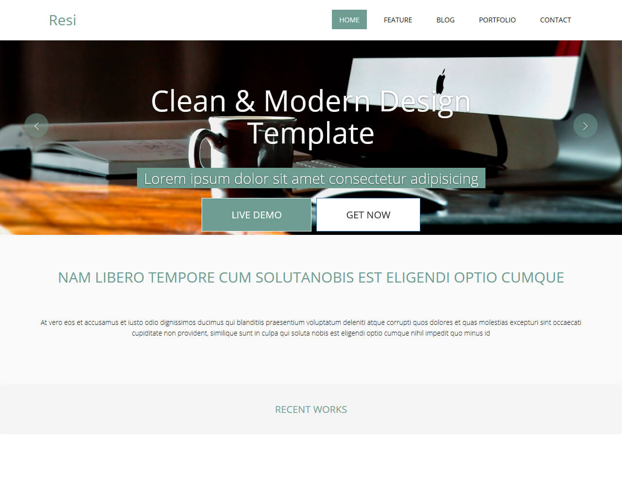
Just like other Bootstrap templates, the Resi is a spotless and contemporary design theme. It can adapt easily to any screen size and is compatible with all mobile devices. This theme is recommended for building a lovely and modern website fast and easy. Developers of this theme make sure it is mobile optimized and fully responsive. Resi is designed with a smooth fluid responsive framework. You will be amazed how your website will look on any screen size or device.
This HTML5 responsive template can change the appearance and feel of the whole theme with its built-in color selection. There are lots of color options you can choose from. Customizing is easy and without any issues. This responsive 3 column template is the flexible, easy and quick way to create a very responsive website. Since it uses percentages, the fluid columns will perfectly fit any width.